Overview
A multiplex immunoassay platform helping scientists detect multiple proteins simultaneously in research and clinical settings. Think of it as a super-detective machine that counts tiny protein workers in our bodies to solve health mysteries.
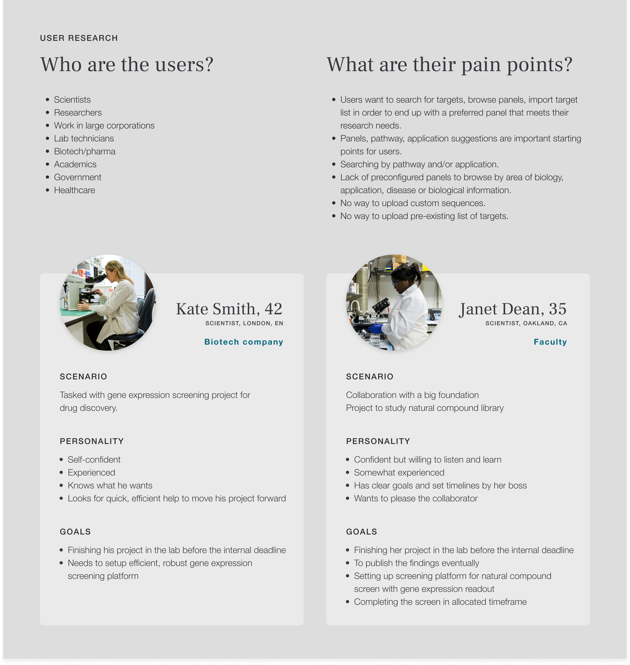
Information Architecture
Project Context & Challenges
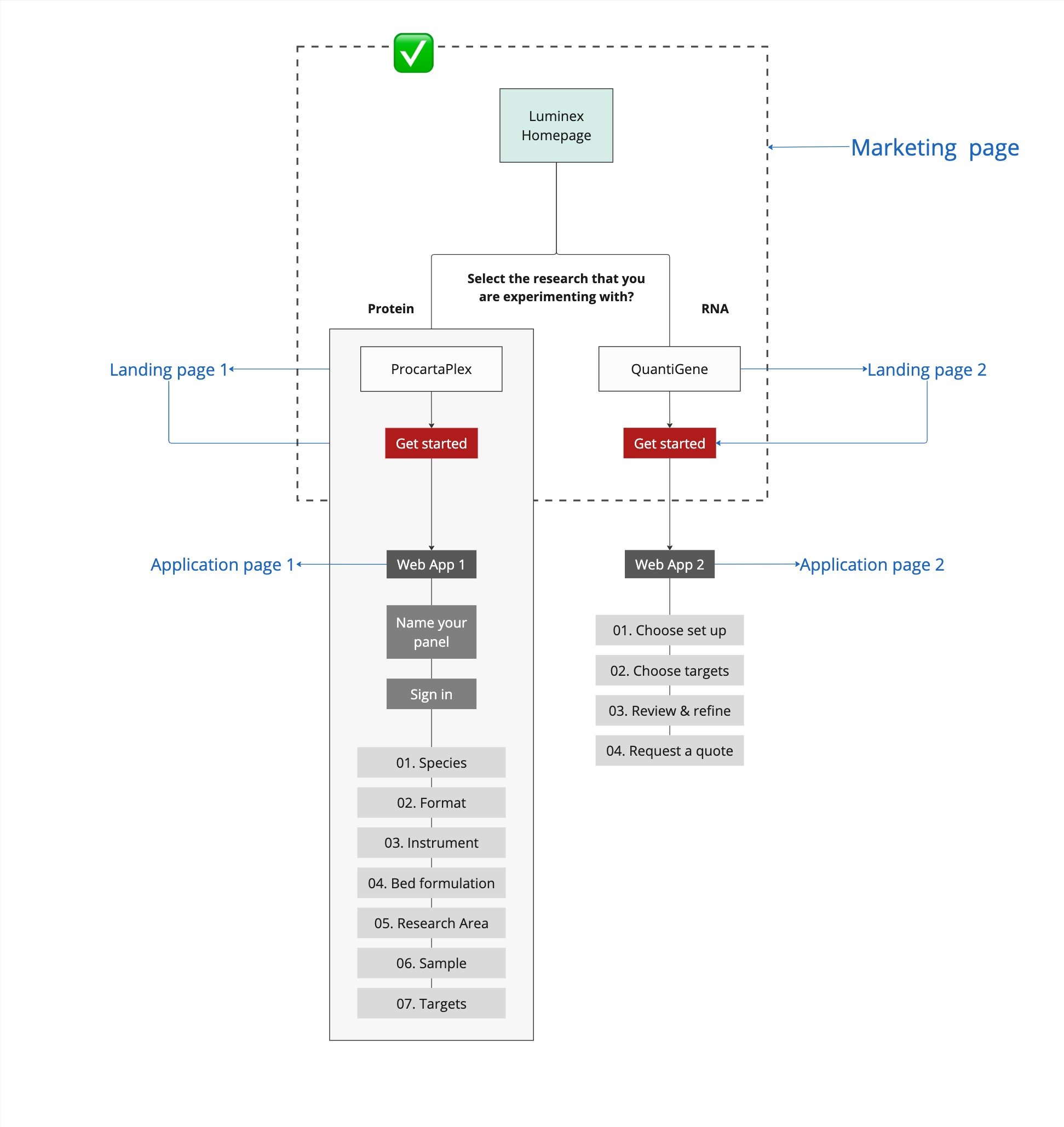
Our cross-functional team was tasked with updating ProcartaPlex, which shared core functionality with its sister product QuantiGene. While stakeholders pushed for interface replication, we identified that ProcartaPlex's unique technical architecture required its own design approach.
Key Platform Issues
Technical Limitations
Manual quote processing created operational bottlenecks
Limited platform capabilities drove users to abandon their experiences and seek alternatives
Accessibility Gaps
Poor responsive design hindered cross-device usage
Inconsistent interface across platforms
Feedback & Error Communication
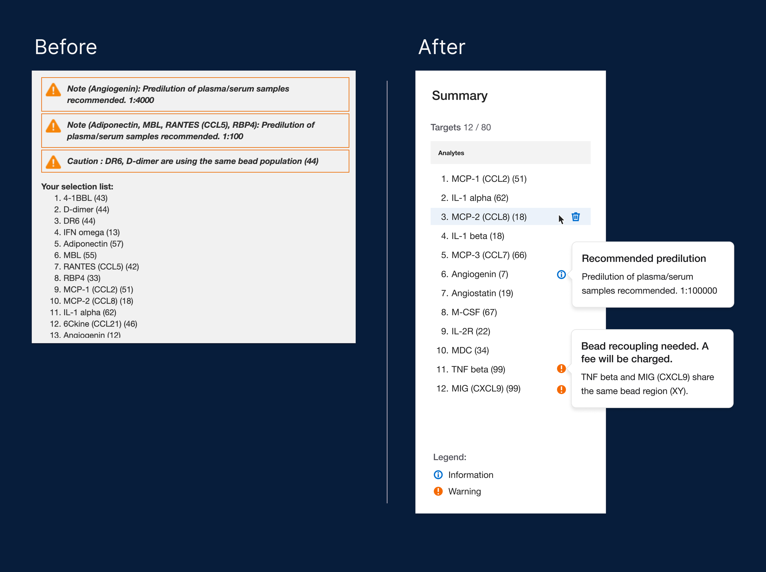
Identical styling between caution and warning states
Confusing feedback messaging across different error types
Unclear notification system led to support calls
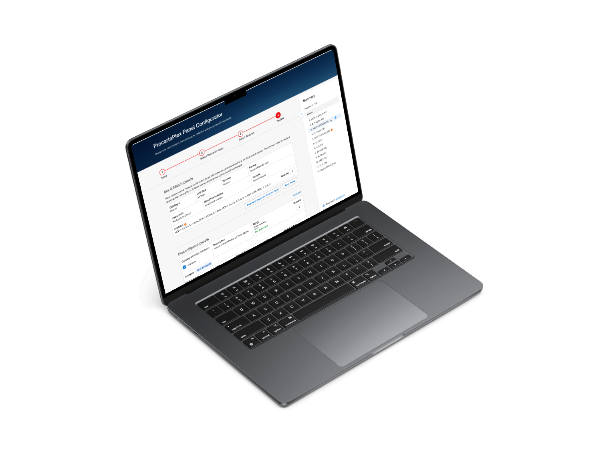
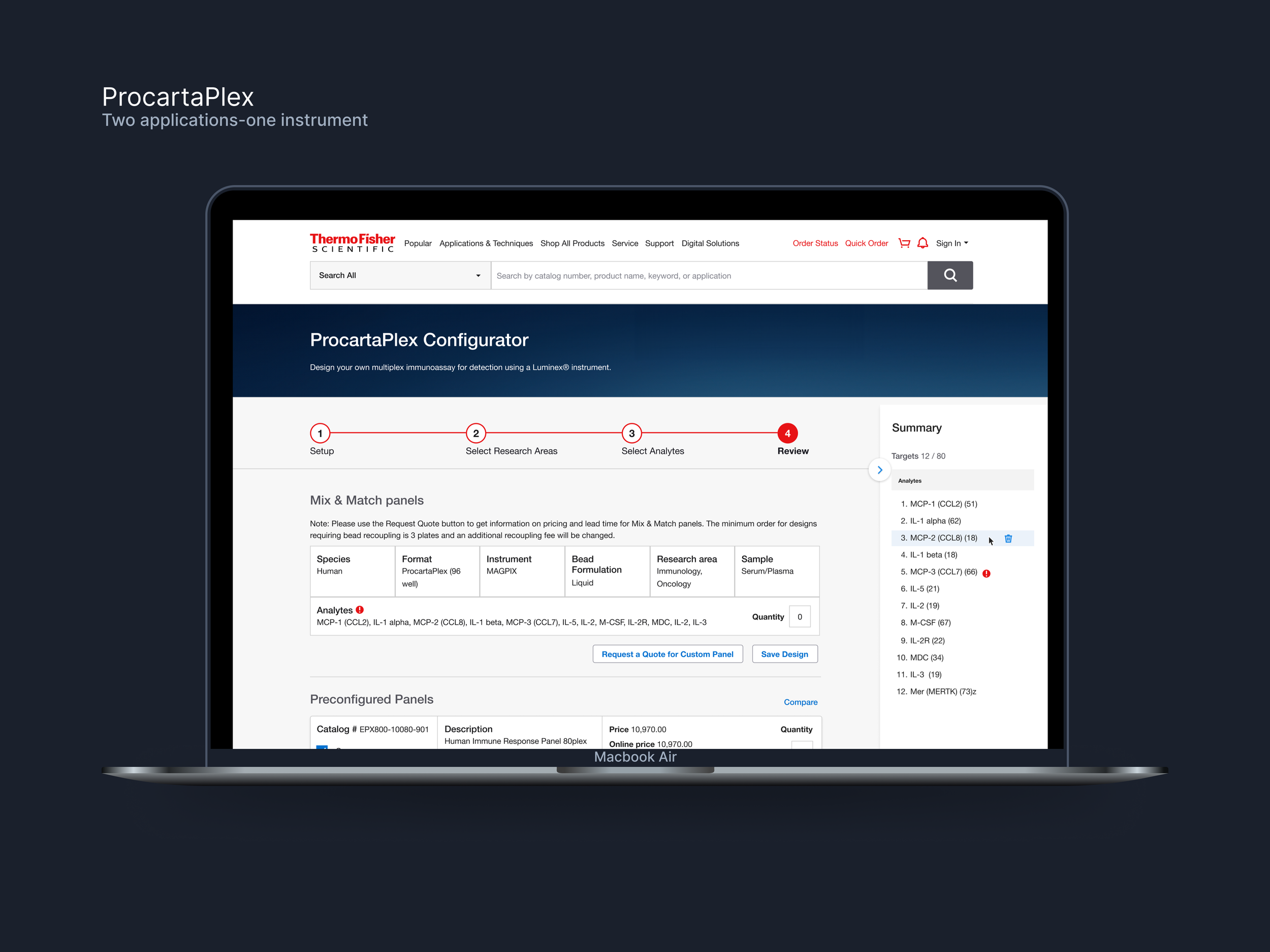
Solution
Platform Modernization
Automated quote generation streamlined purchasing
Built responsive interface for desktop and tablet use
Feedback & Error Redesign
Implemented Thermo Fisher's Komodo Design System to standardize error states
Created distinct visual patterns for four error categories
Reduced support inquiries through clearer messaging
Feedback & Errors in detail
The platform's error system created significant bottlenecks, with users frequently contacting support to clarify ambiguous 'Caution' and 'Note' indicators that shared indistinguishable messaging, iconography, and colors. Through collaboration with support and sales teams, we identified four distinct error categories:
Biological Incompatibility
Recoupling Fee
Predilution
Multiple Issues
Our solution introduced a distinct visual system for each error type, providing clear, actionable feedback. This significantly reduced support inquiries and improved platform efficiency, enabling users to quickly understand and address issues independently.
Impact summary:
Resolved UI ambiguity between error states and feedback
Demonstrates improvement through reduced support tickets


Video Prototype
Results & Initial Impact
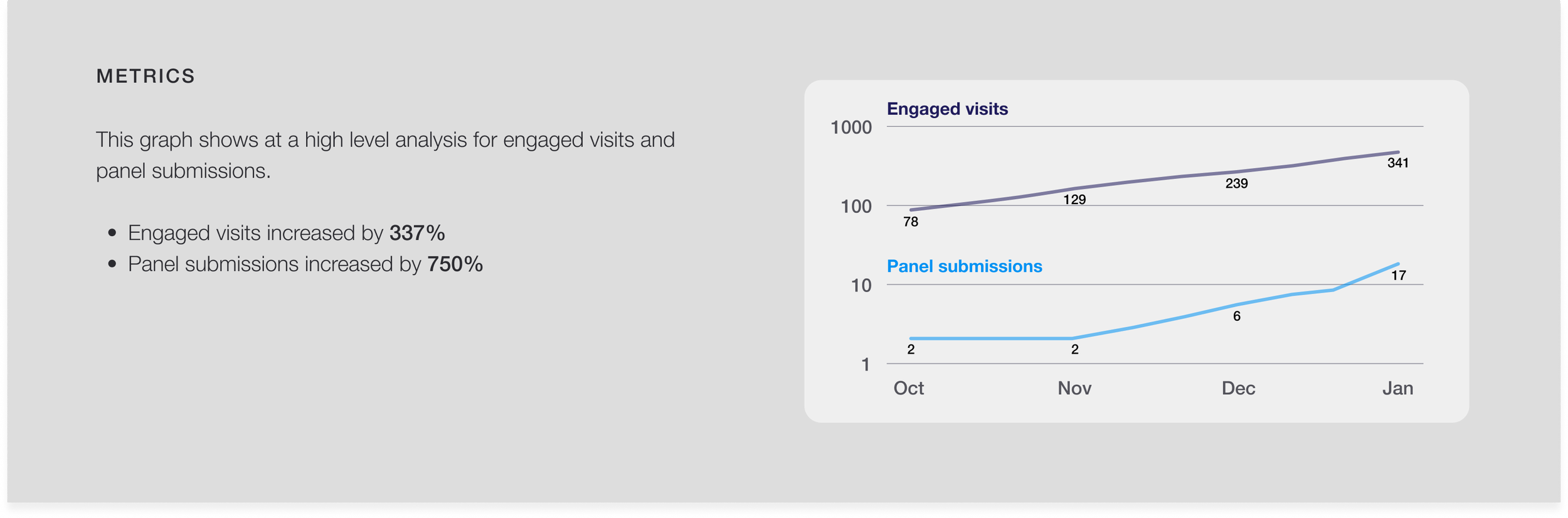
Early Platform Metrics (First 4 Months Post-Launch)
Steady increase in engaged visits from 78 to 341
Panel submissions growing from 2 to 17
Consistent month-over-month growth pattern
Strategic Value
Successfully diverged from QuantiGene replication
Created distinct identity aligned with business goals
Streamlined quote generation process
Key Learnings
Balanced stakeholder vision with technical feasibility
Prioritized user needs over surface-level preferences
Maintained product uniqueness while improving usability
This transformation demonstrates how user-centered design can turn technical constraints into market advantages, driving both user satisfaction and business growth.